Payments Platform Landing Page
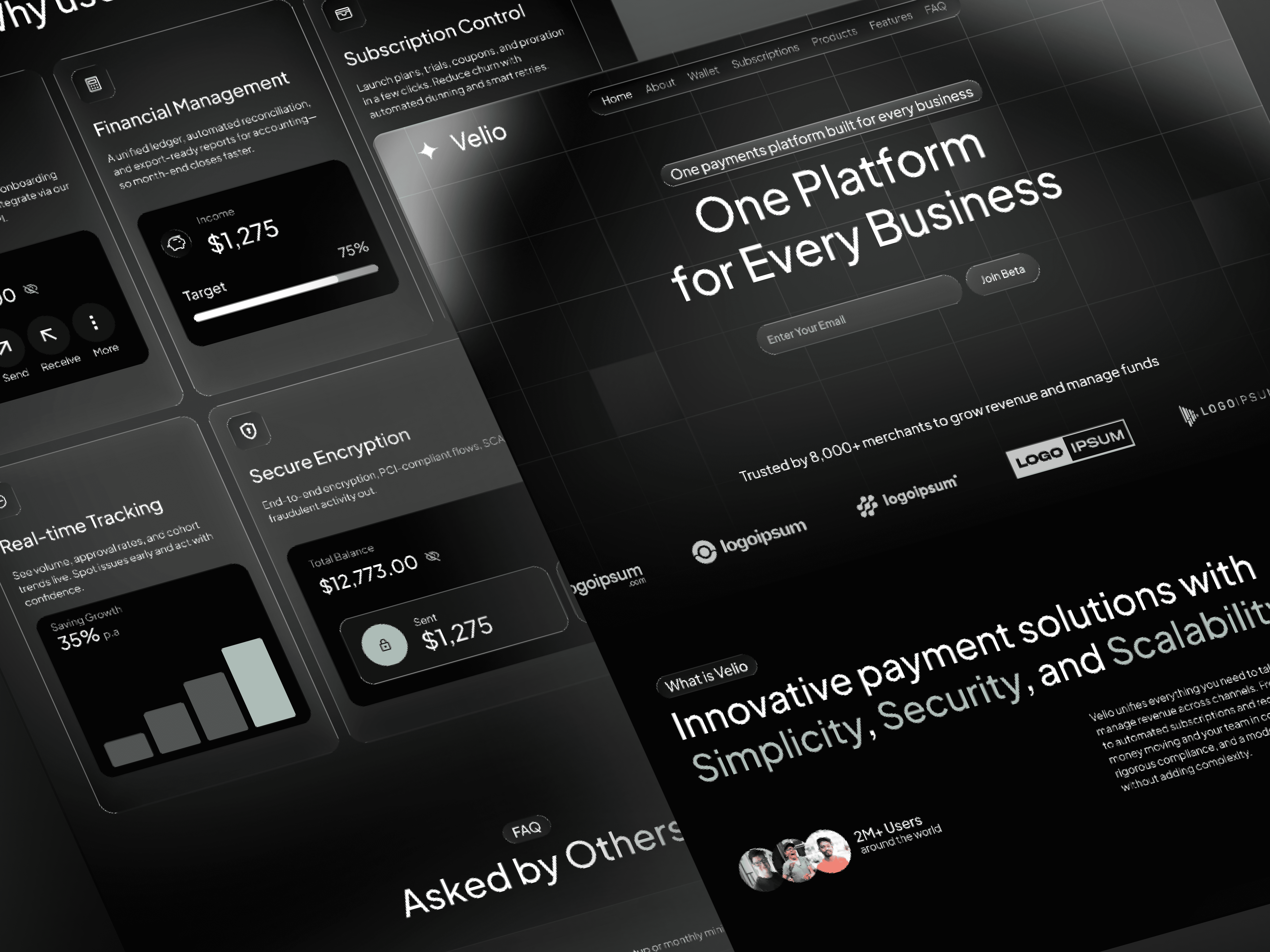
One Platform for Every Business
Services
Payment
Services
Payment
Services
Payment
Tools
Figma
Tools
Figma
Tools
Figma
Value
Make the product easy to understand in one screen, build trust fast, and create clear paths to start or view docs.
Value
Make the product easy to understand in one screen, build trust fast, and create clear paths to start or view docs.
Value
Make the product easy to understand in one screen, build trust fast, and create clear paths to start or view docs.
Timeline
3 Week
Timeline
3 Week
Timeline
3 Week


What I ran into (real problems)
People couldn’t explain the product after the first screen.
Features felt disconnected (Wallet, Subscriptions, Payouts).
Dark UI contrast and focus states were inconsistent.
Copy was long, jargon-heavy, and CTAs were sparse.
How I worked through it
Message first
Wrote a one‑liner promise anyone can repeat.
Added three short support points (security, real‑time insight, scale).
Set dual primary actions: “Get started” and “Talk to sales.”
Information architecture
Clean top nav: Product, Wallet, Subscriptions, Payouts, Pricing, Developers, Company.
Section order optimized for trust and clarity:
Hero → “Meet the platform” → Wallet spotlight → “Why teams choose us” → Security → Insights → FAQ → Testimonials → Final CTA.Repeated CTAs and a sticky nav to reduce hunting.
Wireframes and quick validation
Low‑fi wires to test hierarchy and scan-ability.
5‑second tests on headlines until users could explain the product clearly.
Mid‑fi clickable prototype with tasks:
Understand the value in <5s
Find “Subscriptions”
Verify security info
Start a trial
Visual system on dark mode
Built a high‑contrast palette (WCAG AA+), tuned for dark backgrounds.
Type scale for fast scanning: strong display heads + highly legible body.
Designed reusable blocks: hero, feature cards, metric modules, FAQ accordion, testimonials, CTA bars.
Subtle motion; reduced‑motion friendly.
Content and microcopy
Cut jargon; used short, scannable lines and clear card titles.
Surfaced security early: tokenisation, PCI flows, 3DS, fraud tools.
FAQs matched real questions: cost, security, how it works, subscriptions, and getting started.
Clear labels: “Get started free,” “Talk to sales.” “Read the docs.”
Accessibility and performance
Contrast passes, visible focus rings, and keyboard navigation across components.
Guidance for semantic HTML, responsive images, and lazy loading for below‑the‑fold sections.
Build-ready handoff
Hi‑fi responsive prototype.
Design tokens (color, spacing, radii, elevation, and motion) and component specs.
Analytics plan: track hero CTA clicks, scroll depth, FAQ opens, and Docs clicks.
A/B variants prepared for hero headline and CTA text.


Problems → Fixes (in plain terms)
Slow comprehension → One clear promise + three supports; merchant count and partner logos in the hero.
Disconnected features → Framed the story as “one platform,” then introduced Wallet/Subscriptions as parts of it.
Weak trust → Moved security and social proof higher; added role‑based testimonials.
Hidden dev path → “Developers” in main nav and footer + secondary “Read the docs” CTA.
Dark UI readability → New color ramps; 4.5:1 text contrast; improved chart palette; visible focus states.
Wordy copy, few actions → Short sections, clear intros, repeated CTAs at decision points.
What shipped
Content‑first landing with:
Clear hero and dual CTAs
Platform overview + Wallet spotlight
“Why choose” cards (setup speed, finance ops, subscriptions, insights, security)
Security and Insights sections with concrete details
Helpful FAQ and role‑aligned testimonials
Strong Developer path in nav/footer
Small component library and tokens for fast future pages.
What changed after (early signals)
First‑screen comprehension improved in 5‑second tests.
Higher click‑through on “Get started” versus the old layout.
Accessibility: primary text meets AA; keyboard navigation passes across sections.
Let's work together. Feel free to reach out and
Contact me at: nazmulrabbe14@gmail.com to tell me about your project.
If you like any of my work, please follow me on Dribbble.
Facebook || Instagram || Linkedin || Behance
#productdesign #landingpage #fintech #ux #ui #uxwriting #designsystem #darkmode #accessibility #webdesign #figma #prototyping #productdesign #ux #ui #landingpage #webdesign #fintech #payments #uxwriting #designsystem #componentlibrary #prototyping #figma #darkmode #accessibility #microinteractions #visualdesign #usertesting #developerexperience #api #security
Reach out anytime
Let’s Stay Connected
Got questions or want to collaborate? Feel free to reach out I'm open to new projects or just a casual chat!
BOOK A CALL
REQUEST A QUOTE
Reach out anytime
Let’s Stay Connected
Got questions or want to collaborate? Feel free to reach out I'm open to new projects or just a casual chat!
BOOK A CALL
REQUEST A QUOTE
Reach out anytime
Let’s Stay Connected
Got questions or want to collaborate? Feel free to reach out I'm open to new projects or just a casual chat!
BOOK A CALL
REQUEST A QUOTE


