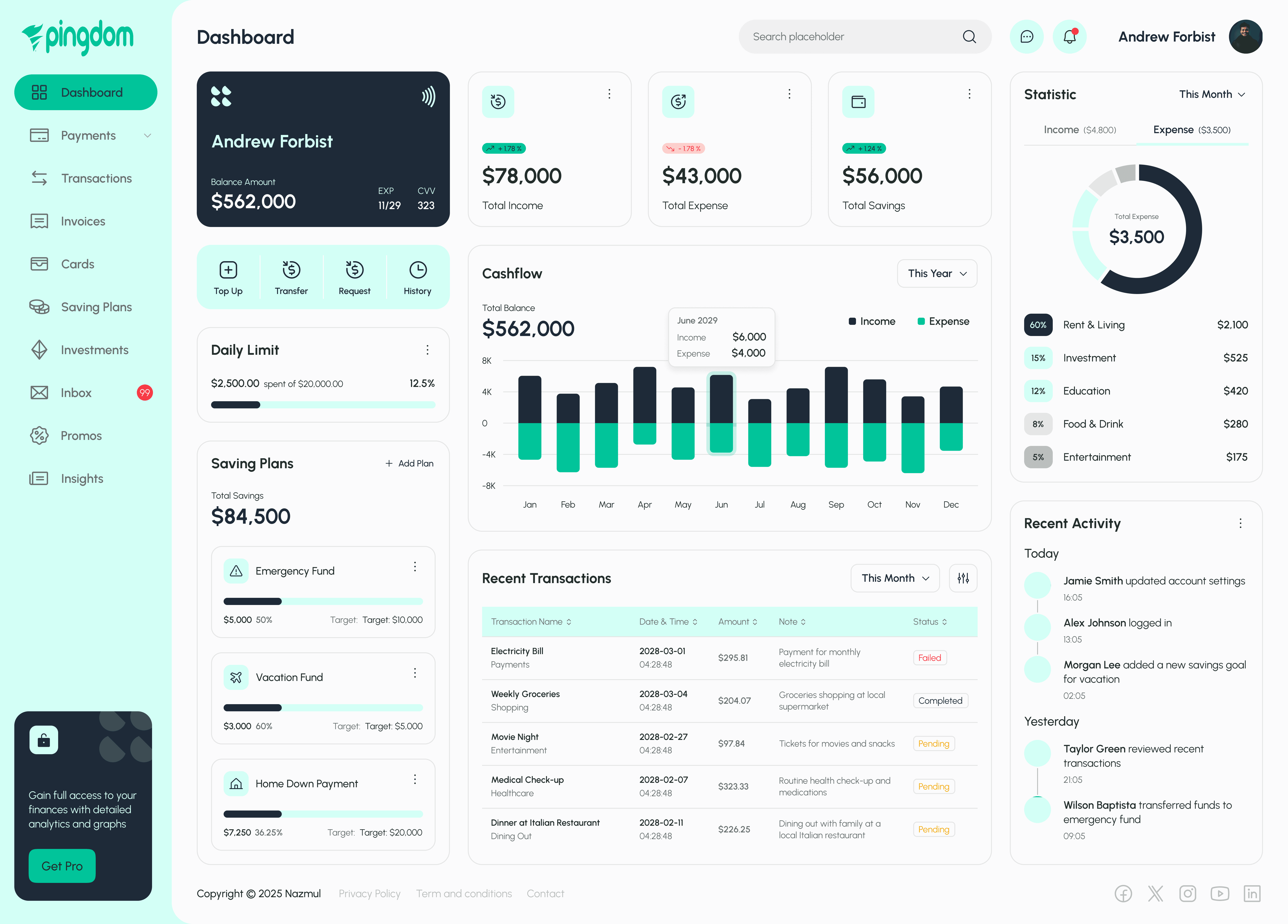
Pingdom Finance
Pingdom Finance Dashboard UI
Services
Dashboard & Analytics Interfaces
Tools
Figma
Value
Empowering users to take control of their finances through a clean, intuitive interface that transforms complex data into actionable insights, So they can track, manage, and grow their money with confidence
Timeline
7 Days
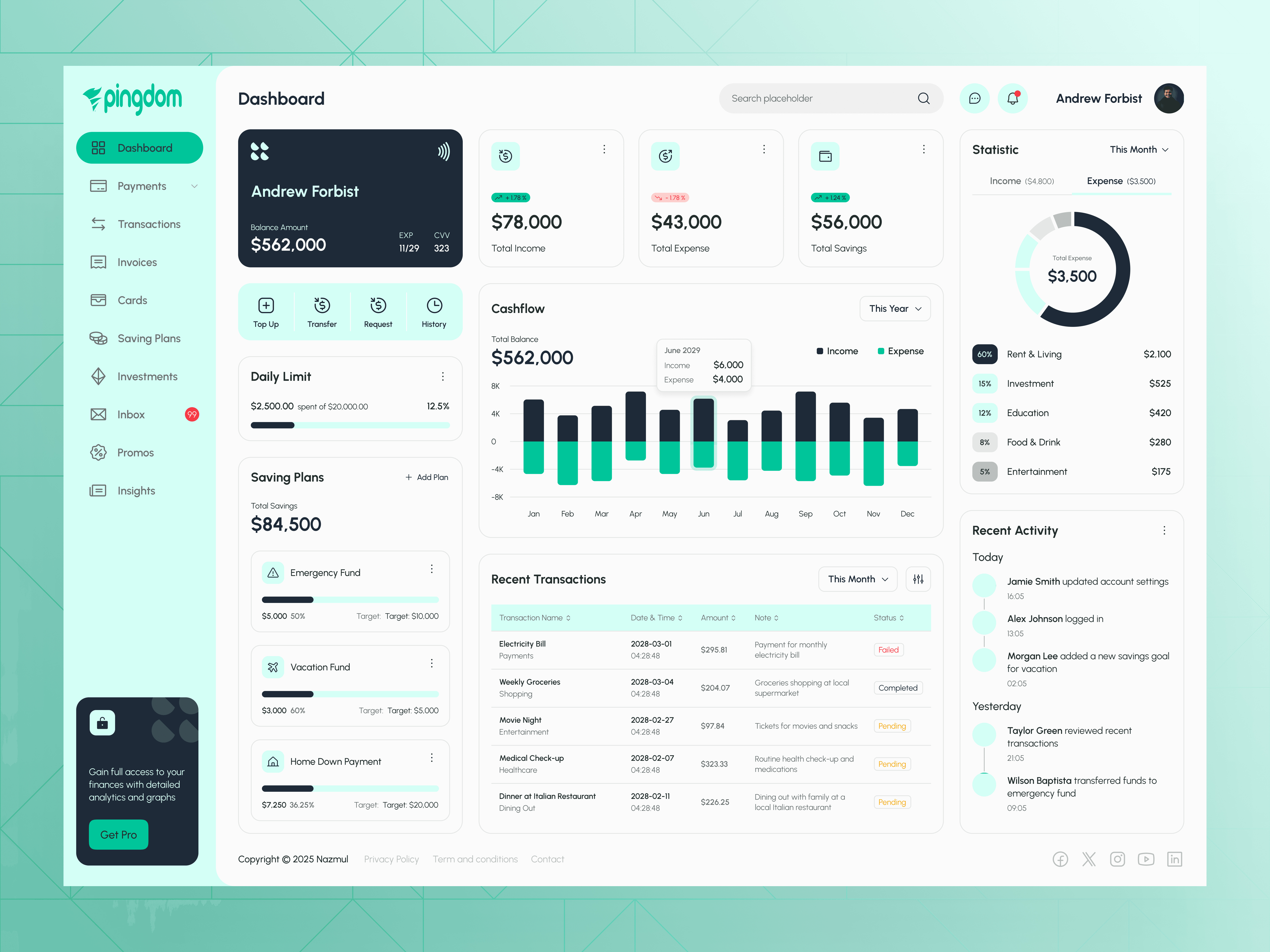
Presenting Pingdom Finance Dashboard, a sleek and modern UI concept for a personal finance app. Designed in Figma, this dashboard showcases a clean layout with intuitive data visualizations—total balance, cash flow charts, savings plans, and expense breakdowns, all at a glance. The soft mint-and-dark-blue colour palette keeps the interface fresh, while bold typography highlights key figures. Swipe through to explore interactive cards (Top Up, Transfer, Request, History), monthly income vs. expense bar charts, and a detailed “Recent Transactions” table. Let me know what you think! ✨🔍